Lugo Channels, Groups & Bots Redesign
A streamlined, intuitive messaging hub that makes discovering channels, joining groups, and engaging with bots simple, seamless, trustworthy, and enjoyable every day


Stage 4 – User Feedback & Iteration
Conducted remote usability sessions with existing Lugo users.
Feedback:
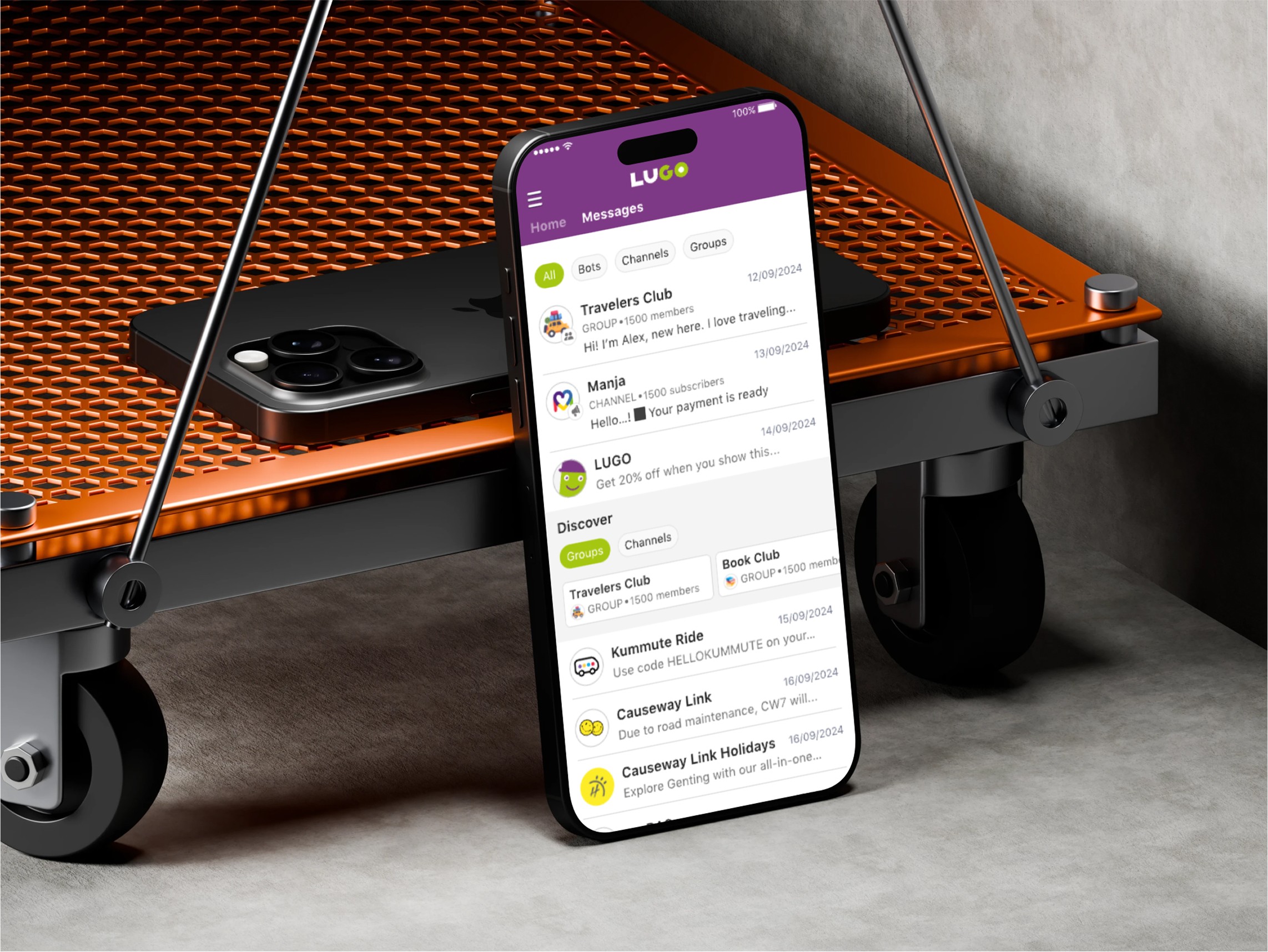
Users loved the cleaner look and clearer tabs but wanted more context in message previews.
Some requested stronger emphasis on official/verified channels.
Iterations:
Adjusted spacing, enhanced preview snippets, and enlarged verification badges to reinforce trust.
Stage 5 – Implementation & Launch Support
Delivered a component-based design system and developer handoff specs in Figma.
Partnered closely with the engineering team during QA to ensure pixel-perfect alignment with prototypes across Android and iOS.
Supplied marketing visuals and updated app-store screenshots highlighting the redesigned Channels & Bots experience.


Other projects
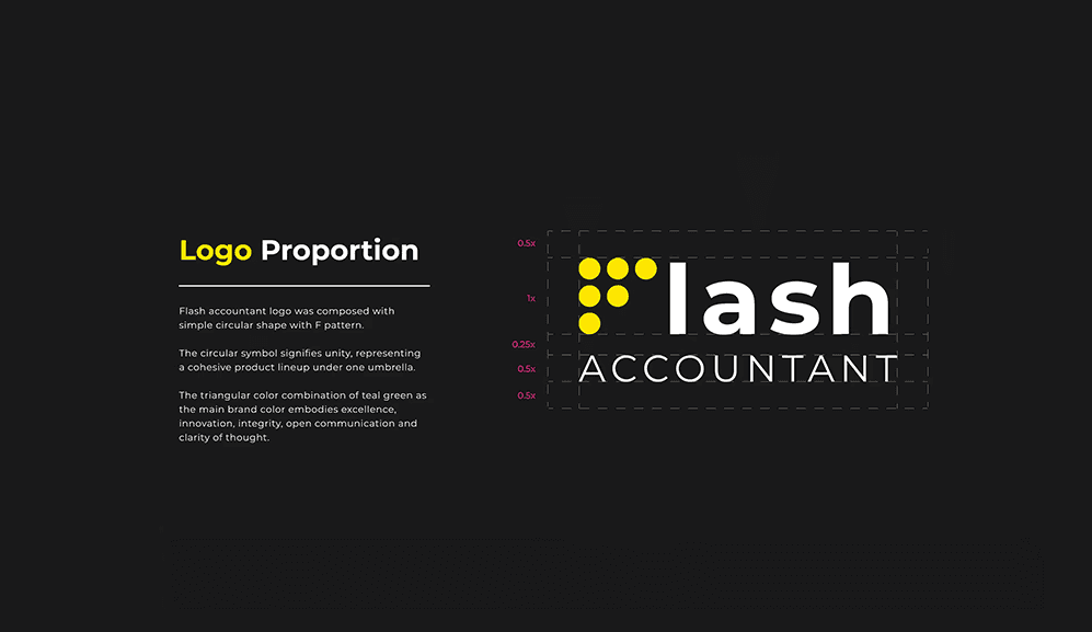
Strategic Corporate Brand Identity
Flash Accountant is a financial consulting firm that provides comprehensive accounting, audit, and corporate services. The client sought a refined brand identity system that communicated trust, clarity, and innovation

Homeowner Listing Management – Pinhome App
Mobile feature that lets Indonesian homeowners quickly list and verify properties, with smart pricing tips and real-time buyer chat for a fast, trusted selling experience.

Kummute App – Seamless Cross Border Taxi Booking
Designing a mobile booking experience that makes licensed cross-border travel between Singapore and West Malaysia safe, transparent, and effortless, ensuring reliable drivers and smooth, worry free journeys for every passenger